
Makeover Monday 2020 Week 6 –– What Percentage of Your Life Has Been Spent in American Wartime?
For this week’s challenge, we are looking at the percentage of lifetime according to birth year where the USA was at war.
Source Article: Nearly a quarter of Americans have never experienced the U.S. in a time of peace
Data Source: Washington Post
Makeover Monday Data: data.world
My Github Repository: US Wartime Living Repo
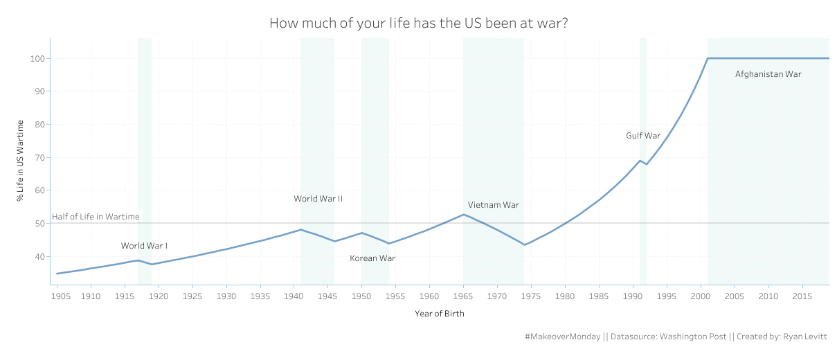
My Final Tableau Visualization: US Wartime Visualization
The original visualization lacks clarity with respect to how specific wars impact the overall total percent of life spent in wartime. There is a ring around year year’s pie chart with a legend above, but the lines are pretty difficult to make out and trying to parse which lines correspond to which wars is difficult.
I decided to do a superficial exploration of the data and then let my findings inform a different kind of visualization that maybe leads to new takeaways. This post contains most of my results, but for the full Python script, check out the repository linked above.
Data Analysis
Looking at the Data:
Here is quick overview of the Excel file that we were given. It is pre-cleaned and straightforward.
| Birth_Year | Percent_Lifetime_in_US_Wartime | |
|---|---|---|
| 0 | 1905 | 0.348 |
| 1 | 1906 | 0.351 |
| 2 | 1907 | 0.354 |
| 3 | 1908 | 0.357 |
| 4 | 1909 | 0.360 |
Summary Statistics:
Next, I take a quick look at the summary statistics to review to scope and structure of the data.
| Birth_Year | Percent_Lifetime_in_US_Wartime | |
|---|---|---|
| count | 115.000000 | 115.000000 |
| mean | 1962.000000 | 0.574635 |
| std | 33.341666 | 0.221140 |
| min | 1905.000000 | 0.348000 |
| 25% | 1933.500000 | 0.436000 |
| 50% | 1962.000000 | 0.471000 |
| 75% | 1990.500000 | 0.673000 |
| max | 2019.000000 | 1.000000 |
The data covers 115 years from 1905 to 2019. The minimum percentage spent at war is 34.8%, the mean is 57.5% with a standard deviation of 22.1%, the median is 47.1%, and the max is 100%.
From a visual communication perspective, two pieces of information from our summary statistics stand out. Firstly, years with 100% wartime should be of particular interest. The fact that every American born since a certain year have only ever lived in American wartime is a powerful statistic. The second is more nuanced. Given our mean and medium hover around 50%, we should pay careful attention to when we cross the 50% line. Like the 100% marker, the 50% marker is powerful because it is the point at which Americans have spent the majority of their lifetime in American wartime.
Given the significance of this crossing point, a line graph with some explanatory features might offer an interesting take on the data.
Initial Graph:
Before I delve into some potential features, this is the base of the graph.

Data Exploration:
Birth Years with 100% Wartime
The first feature to look into is the 100% wartime periods
| Birth_Year | Percent_Lifetime_in_US_Wartime | |
|---|---|---|
| 96 | 2001 | 1.0 |
| 97 | 2002 | 1.0 |
| 98 | 2003 | 1.0 |
| 99 | 2004 | 1.0 |
| 100 | 2005 | 1.0 |
| 101 | 2006 | 1.0 |
| 102 | 2007 | 1.0 |
| 103 | 2008 | 1.0 |
| 104 | 2009 | 1.0 |
| 105 | 2010 | 1.0 |
| 106 | 2011 | 1.0 |
| 107 | 2012 | 1.0 |
| 108 | 2013 | 1.0 |
| 109 | 2014 | 1.0 |
| 110 | 2015 | 1.0 |
| 111 | 2016 | 1.0 |
| 112 | 2017 | 1.0 |
| 113 | 2018 | 1.0 |
| 114 | 2019 | 1.0 |
Every American born since 2001 has never experienced the United States in peacetime.
Birth Years more than 50% Wartime
Next, we look into the 50% line. I approached this by selecting values of Percent_Lifetime_in_US_Wartime between .48 and .52. These years should give us a sense of crossing points.
| Birth_Year | Percent_Lifetime_in_US_Wartime | |
|---|---|---|
| 36 | 1941 | 0.481 |
| 55 | 1960 | 0.483 |
| 56 | 1961 | 0.492 |
| 57 | 1962 | 0.500 |
| 58 | 1963 | 0.509 |
| 59 | 1964 | 0.518 |
| 61 | 1966 | 0.519 |
| 62 | 1967 | 0.509 |
| 63 | 1968 | 0.500 |
| 64 | 1969 | 0.490 |
| 74 | 1979 | 0.488 |
| 75 | 1980 | 0.500 |
| 76 | 1981 | 0.513 |
Americans born in 1963-1967 and 1981-present have spent the majority of their lives in wartime.
Reverse Engineering Specific War Dates and Statistics
The most important feature to include for me is probably the correspondence of specific wars to movements in the data. These actually needed to be reverse engineered from the data because the war dates that the article used did not match those you might find from quick research.
Wartime should, counterintuively, be associated with a decrease in Percent_Lifetime_in_US_Wartime. While this may seem strange at first, the peak for Percent_Lifetime_in_US_Wartime is the beginning of a war and as you look at people born later into the war, their Percent_Lifetime_in_US_Wartime is lower than those born at the beginning. The only exception to this is in an ongoing, current war. In this case, the value will stagnate. This logic also holds for peacetime. Increases in Percent_Lifetime_in_US_Wartime are then always associated with peacetime and decreases or stagnancy are always associated with wartime. The code here was probably the most complex of any in this small project with some nested np.where and calculating both forward and backward column diffs to make sure that years at both the maxima and minima are labeled as wartime.
| Birth_Year | Percent_Lifetime_in_US_Wartime | War_State | |
|---|---|---|---|
| 0 | 1905 | 0.348 | peacetime |
| 1 | 1906 | 0.351 | peacetime |
| 2 | 1907 | 0.354 | peacetime |
| 3 | 1908 | 0.357 | peacetime |
| 4 | 1909 | 0.360 | peacetime |
| 5 | 1910 | 0.364 | peacetime |
| 6 | 1911 | 0.367 | peacetime |
| 7 | 1912 | 0.370 | peacetime |
| 8 | 1913 | 0.374 | peacetime |
| 9 | 1914 | 0.377 | peacetime |
| 10 | 1915 | 0.381 | peacetime |
| 11 | 1916 | 0.385 | peacetime |
| 12 | 1917 | 0.388 | wartime |
| 13 | 1918 | 0.382 | wartime |
| 14 | 1919 | 0.376 | wartime |
| 15 | 1920 | 0.380 | peacetime |
| 16 | 1921 | 0.384 | peacetime |
| 17 | 1922 | 0.388 | peacetime |
| 18 | 1923 | 0.392 | peacetime |
| 19 | 1924 | 0.396 | peacetime |
Using the wartime and peacetime labels, I moved through each set of wartime birth years and attached a war label.
| Birth_Year | Percent_Lifetime_in_US_Wartime | War_State | War | |
|---|---|---|---|---|
| 0 | 1905 | 0.348 | peacetime | None |
| 1 | 1906 | 0.351 | peacetime | None |
| 2 | 1907 | 0.354 | peacetime | None |
| 3 | 1908 | 0.357 | peacetime | None |
| 4 | 1909 | 0.360 | peacetime | None |
| 5 | 1910 | 0.364 | peacetime | None |
| 6 | 1911 | 0.367 | peacetime | None |
| 7 | 1912 | 0.370 | peacetime | None |
| 8 | 1913 | 0.374 | peacetime | None |
| 9 | 1914 | 0.377 | peacetime | None |
| 10 | 1915 | 0.381 | peacetime | None |
| 11 | 1916 | 0.385 | peacetime | None |
| 12 | 1917 | 0.388 | wartime | WW1 |
| 13 | 1918 | 0.382 | wartime | WW1 |
| 14 | 1919 | 0.376 | wartime | WW1 |
| 15 | 1920 | 0.380 | peacetime | None |
| 16 | 1921 | 0.384 | peacetime | None |
| 17 | 1922 | 0.388 | peacetime | None |
| 18 | 1923 | 0.392 | peacetime | None |
| 19 | 1924 | 0.396 | peacetime | None |
Finally, I looked at some of the summary statistics grouped by war for some additional insights.
| Birth_Year | Percent_Lifetime_in_US_Wartime | |||||||||||||||
|---|---|---|---|---|---|---|---|---|---|---|---|---|---|---|---|---|
| count | mean | std | min | 25% | 50% | 75% | max | count | mean | std | min | 25% | 50% | 75% | max | |
| War | ||||||||||||||||
| Afghanistan War | 19.0 | 2010.0 | 5.627314 | 2001.0 | 2005.50 | 2010.0 | 2014.50 | 2019.0 | 19.0 | 1.000000 | 0.000000 | 1.000 | 1.00000 | 1.0000 | 1.00000 | 1.000 |
| Gulf War | 2.0 | 1991.5 | 0.707107 | 1991.0 | 1991.25 | 1991.5 | 1991.75 | 1992.0 | 2.0 | 0.684500 | 0.007778 | 0.679 | 0.68175 | 0.6845 | 0.68725 | 0.690 |
| Vietnam War | 10.0 | 1969.5 | 3.027650 | 1965.0 | 1967.25 | 1969.5 | 1971.75 | 1974.0 | 10.0 | 0.483400 | 0.031045 | 0.435 | 0.46075 | 0.4850 | 0.50675 | 0.527 |
| Korean War | 5.0 | 1952.0 | 1.581139 | 1950.0 | 1951.00 | 1952.0 | 1953.00 | 1954.0 | 5.0 | 0.455600 | 0.012661 | 0.439 | 0.44800 | 0.4560 | 0.46400 | 0.471 |
| WW2 | 6.0 | 1943.5 | 1.870829 | 1941.0 | 1942.25 | 1943.5 | 1944.75 | 1946.0 | 6.0 | 0.463833 | 0.013106 | 0.446 | 0.45500 | 0.4645 | 0.47250 | 0.481 |
| WW1 | 3.0 | 1918.0 | 1.000000 | 1917.0 | 1917.50 | 1918.0 | 1918.50 | 1919.0 | 3.0 | 0.382000 | 0.006000 | 0.376 | 0.37900 | 0.3820 | 0.38500 | 0.388 |
We see here how different wars extended wartime experience for Americans. The Vietnam War and Afghanistan Wars are distinctly long. We also see here that the Vietnam War manages to temporarily push the percentage in wartime above 50% for a short period in the mid 1960s before the percentage resurges in peacetime births near the Afghanistan War.
Deeper Data Graph:
I made a quick pyplot graph to confirm my work before heading over to Tableau.
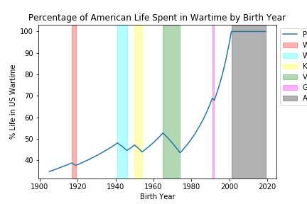
The decreases properly match their wars and includes extrema.
Tableau Graph:
My Tableau visualization is published here.

Conclusions
I think the explicit naming of the wars and clearer representation of how the percentages shift over time is interesting. I think my visualization is ultimately successful in contributing a new perspective on the data. I think with some more experience with Tableau and more time invested in this project, I would make a few changes to further emphasize some of the points I established in the exploration phase. For example, I could more explicitly point with textboxes and arrows to the Afghanistan War’s 2001 100% wartime statistic and the two 50% crossing points. The biggest weakness for my visualization is the counterintuitive nature of decreasing percentages in wartime. I did not really anticipate how the data actually works against a line graph and that its computation seems meant more for looking up your own birth year rather than looking at trends across birth years. I think this is something to learn from. My visualization succeeds at the general picture of the spread of American wars over the last century but if a viewer spends more time trying to properly interpret it, I think it actually becomes more confusing.
Overall, I really enjoyed this first attempt at Makeover Monday and am really happy to be making progress with Tableau. I’m excited for next week.